Bonjour Paris! The type design community in Paris is buzzing and today, we’re looking at one of the younger foundries that has already received a lot of praise. Interval Type is the foundry of art director and type designer Ilya Naumoff. Before he founded Interval Type, Ilya was part of Black[Foundry] and worked with foundries in France and Switzerland.
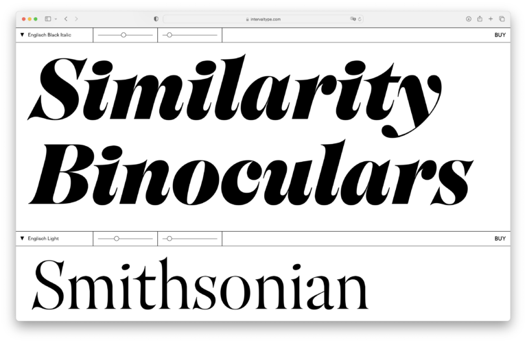
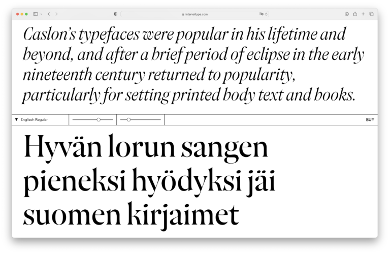
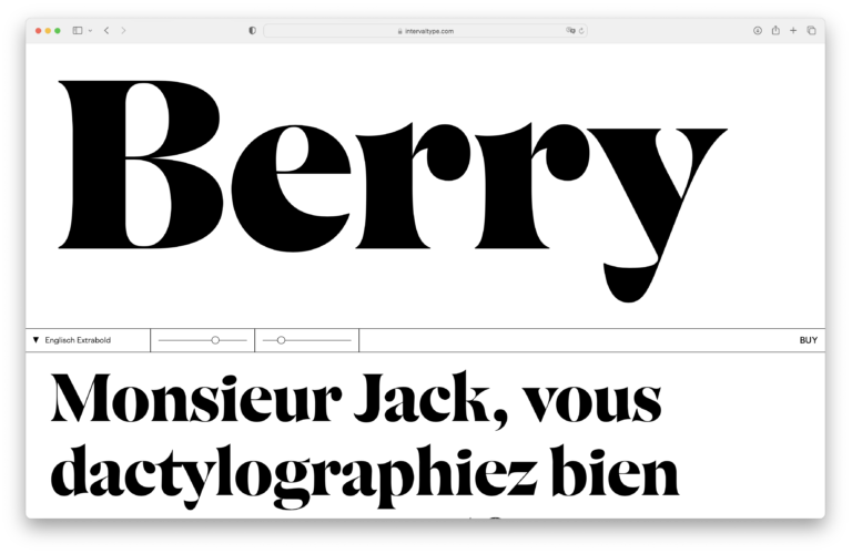
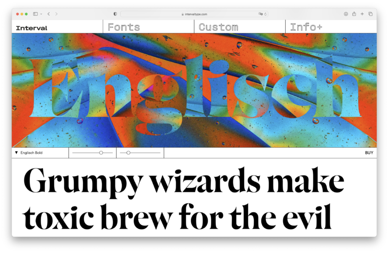
The library of Interval Type is small but already full of gems. Englisch is a playful display typeface that draws inspiration from 17th and 18th century English type designs to create a slightly eccentric and charming contemporary design that has been awarded with a TDC award for type design this year.
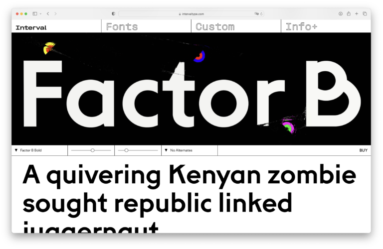
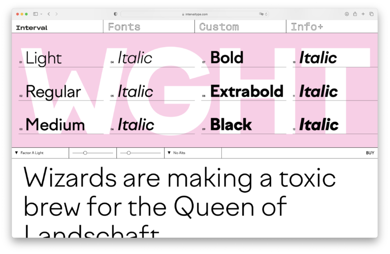
Factor A and Factor B are the geometric sans-serifs in the collection. Factor A is the warmer of the two, Factor B is more rational in its shapes. But both have a contemporary appeal, not only because of little quirky details but also because of a wide set of squiggly alternates.
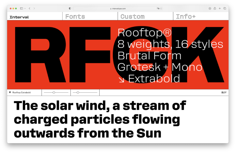
Rooftop is a sturdy grotesk inspired by the american grotesks of the early 20th century but with slightly squarish curves, a design detail that I fondly remember from designs like T-Star and my only clumsy attempt at type design as a student in the early 2000s. Stravinsky is a a slightly chaotic, experimental grotesk display typeface.
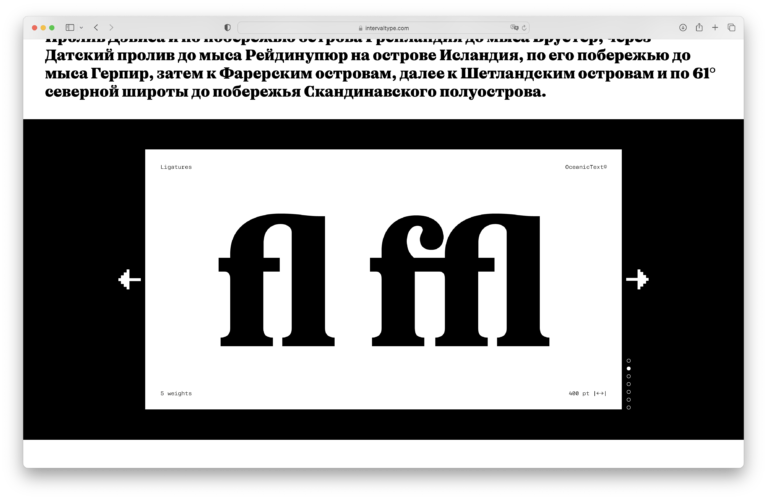
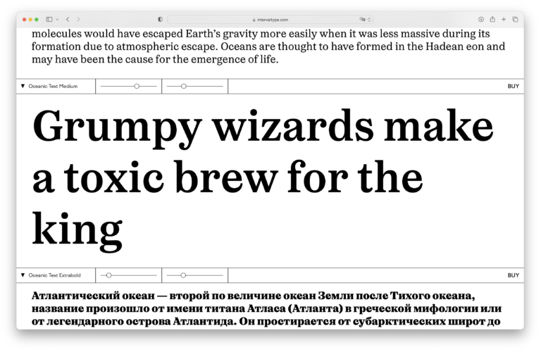
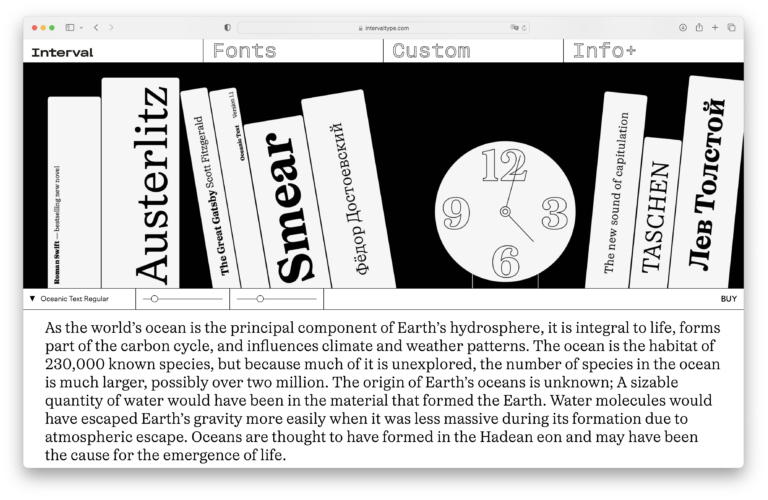
And then there is Oceanic. Full of bold, organic shapes and exuberant, contrasting friskiness. Odd, quirky, elegant – and TDC-awarded in 2022 as well. Oceanic Text, the more sober serif counterpart for running text completes the family, creating the perfect mix for a wide range of applications.
For all fonts, you can get free trial fonts with a limited character set.







❦
This post is part of the Independent Type Foundry Advent Calendar 2022
~


