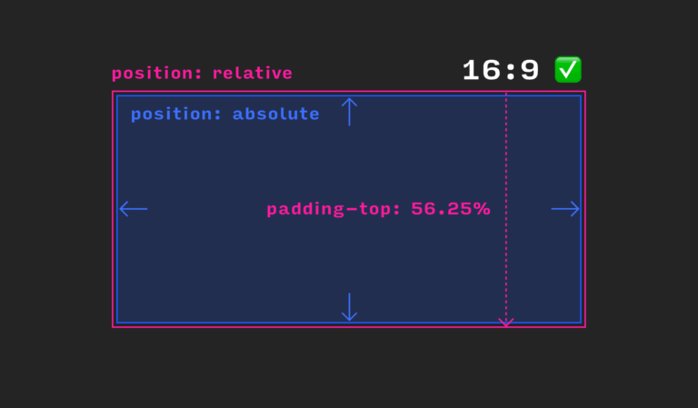
Layout on the Web is all about flexibility. That elements adjust their dimensions to the size of their content, be it texts of varying length or images of different sizes, is a welcome feature, especially in times of Responsive Web Design because this flexibility makes building responsive layouts possible in the first place. Sometimes, though, we need an element with a fixed aspect ratio, for example, if we want to embed a video via an iframe or to show images cropped to a fixed aspect ratio, regardless of their original dimensions. In such cases, the infamous vertical padding hack has become our method of choice. It goes a little something like this:
.aspect-ratio-hack {
  position: relative;
  height: 0;
  padding-top: 56.25%;

  .inner {
	  position: absolute;
	  top: 0;
	  right: 0;
	  bottom: 0;
	  left: 0;
  }
}
In CSS, you can’t simply set the height of an element in relation to its width. Yet this would be needed to define an aspect ratio for an element. If you set a value for vertical padding in percent, though, it is always calculated with respect to the current width of the element. And that is exactly what we harness with the vertical padding hack: If we want to maintain an aspect ratio of 16:9, for example, we set the padding-top of the outer container to 56.25% (because 100 % / 16 * 9 = 56.25 %) and the height to 0. Now, our container has the right dimensions but because its height is 0, the content wouldn’t be visible. That’s why we use an .inner element to wrap the content and set its position to absolute. The inner element is pulled out of the document flow and we can now set its top, right, bottom, and left positions to 0 so that it completely fills the space of its parent. The outer element has itself a position of relative. This way, we make sure that the absolute position of the inner element is calculated based on the outer element because for elements with position: absolute, the browser always looks for the closest ancestor that is not statically positioned to determine the position.

And that’s it! Our element has a fixed aspect ratio. But as clever as this technique is, it still feels like a dirty hack. We are using padding to set the height of an element with height: 0 and are combining it with an additional wrapper that is absolutely positioned. If that is not a layout hack, I don’t know what is.
Over time, people came up with many variations of the vertical padding hack. But although setting the aspect ratio with data-attributes or custom properties (CSS variables) might be a bit more modern approaches, all those solutions are still hacks.
A Slightly Better Hack
The most sophisticated version of the padding hack might be what Chris Coyier calls the pseudo-element tactic. In the example above, we have set a fixed aspect ratio. But what if there is too much content inside our element, for example, a truckload of text that might fit into the container on larger screens but will overflow on smaller viewports?

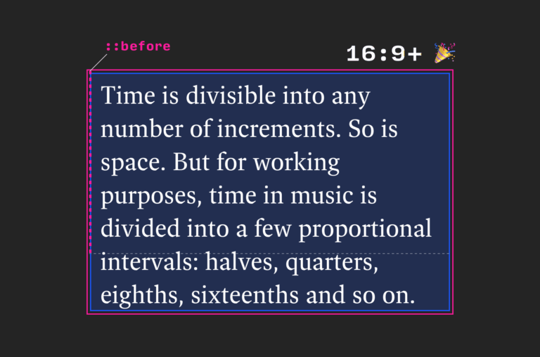
Because we defined a fixed height, our container can’t grow accordingly. Essentially, what we want to achieve instead is something like a min-aspect-ratio. The trick is to apply the padding to a pseudo-element instead of the element itself. This way, the content can still make our element grow but it has at least the height of the pseudo-element – which we float out of the way:
.aspect-ratio-hack-better {
  &::before {
    content: "";
    padding-top: 56.25%;
    float: left;
  }

  &::after {
    clear: left;
    content: " ";
    display: table;
  }
}

The vertical padding hack with pseudo-element tactic: The pseudo-element defines the min-height according to the aspect ratio but the element can still grow with its content.
A Look Into The Future: aspect-ratio
But wouldn’t it be nice – and more intuitive for beginners – to have a way to set the aspect ratio in CSS without any hacks? This is exactly what the CSS Working Group proposed last year: a new CSS property named aspect-ratio. The property, which still has to be implemented by browser vendors, will let you define a simple ratio like 16 / 9.
.aspect-ratio {
  aspect-ratio: 16 / 9;
}
If you want to play around with aspect-ratio, you can do so in Chrome Canary with the Experimental Web Platform Features flag set. And as Chris Coyier notes in his excellent article on CSS-Tricks, aspect-ratio does support overflowing content and can be overridden by setting min- and max-width or height, respectively, for example. aspect-ratio will also let an element expand if it breaks out of the aspect ratio, but you can also constrain the height to the aspect ratio by adding min-height: 0.
Setting the aspect ratio of an element will remain a hack for the foreseeable future, but with the aspect-ratio property, a much more accessible and straightforward solution is just around the corner.
In the meantime, here is a Codepen for you to tinker with.
See the Pen Apect Ratio Playground by Matthias Ott (@matthiasott) on CodePen.
-
This is the 56th post of my 100 days of writing series. You can find a list of all posts here.
~


